A special thank you to Big Duck and authors Wing-Sze Ho and Sandy Zimmerman for permission to reprint their article here.
What is “accessible”?
Dictionary definitions of accessible include general ideas like “able to be easily obtained or used” or “easily understood.” In the context of communications and design specifically, however, the term “accessibility” refers to very specific practices around ensuring that our messages are inclusive and usable by everyone, including the millions of individuals with partial sight such as blindness, low vision, color‑blindness, and with many other disabilities and situations. Here we look to the ADA (Americans with Disabilities Act) for guidance on wayfinding signage and other situations and especially to the Web Content Accessibility Guidelines (WCAG), which have defined best practices on screen.
Where does accessibility meet branding?
 All brands—especially nonprofit brands—should strive to be inclusive and free from barriers. If we ignore these practices, we should consider who we might be missing—who are we excluding? Nonprofit brands should be easily understood, easily usable, and engaging to all.
At Big Duck, we are growing our own skills and understanding around accessibility and learning to approach it as a mindset, rather than a “one and done” goal. Because brands incorporate a multitude of channels and forms of communication, there’s no one checklist or cheat sheet to subscribe to. However, we need to ensure that the designs we develop are equipped to meet the accessibility standards on a website, on wayfinding signage, and more, while still expressing their unique personalities. So, as designers, we are learning to ask ourselves questions like: What colors are we specifying and how will we ensure proper color contrast online? What fonts are we choosing and will that help foster legible communication? What other positive accessibility practices can an organization implement and reinforce within its brand guidelines?
Contrast
 With partial vision like color blindness in mind, contrast is key when it comes to color choices. We don’t need to limit our color choices, but we do need to ensure that when a brand presents content (especially on the web), we can do so without relying upon color to convey important distinctions or meaning. For example, if we want light pink as a primary brand color, we need to be aware that we’ll need to pair that light pink with a dark color for presenting information with sufficient contrast. This is important with text, but also situations like data visualization, where color is often relied upon for differentiation.
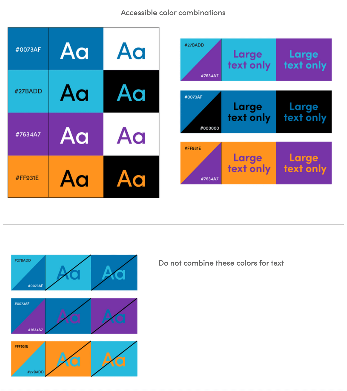
There are many online tools, such as from Web AIM that allow you to test your own color values and provide you with a color contrast ratio, or from Use All Five, which allows you to enter multiple color combinations at a time. We now make it a standard practice to include these color contrast charts in brand guides, so that it is available to all users of the brand. Here’s an example from TSC Alliance’s new brand, which shows color combinations are accessible and which ones to stay away from or use carefully.

Legible typography
In addition to color contrast, when it comes to typography, consider font and layout choices with legibility in mind. Choose brand typefaces that are clear and distinct at both large and small scales, rather than overly decorative or complicated options. We should also avoid very light weights of a font. Be mindful of minimum type sizes, and adequate line spacing and letter spacing. If more stylistic choices are utilized, it is best to save them for larger display text, rather than body copy. Check out this blog article for some great examples of best practices regarding type and color.
Other considerations
Your brand guide can be a great place to document and remind users of various practices when it comes to the experience of your brand in the world beyond these design-specific suggestions. For example, you might consider implementing guidelines around using ASL interpretation at your events, using captions and alt text for all images on your website, social media, and even on PDFs distributed to the public. You might also consider an online tool like Userway that allows users to shift contrast (and various other adjustments) to signal that your organization is prioritizing and investing in inclusion.
By committing to barrier-free access for everyone, your organization can reach not only a wider audience who shares your values, but also enhance your brand presence. Improving their experience with you and the usability of your materials becomes a foundation for building positive relationships. To keep that commitment ongoing, ensure that accessibility practices are an integral part of your workflow and then continue to mindfully identify new opportunities to further cement it into the culture of your organization.


0 Commentaires