Donation Page Optimization: Best Practices for Nonprofit Fundraising
Why your donation pages matter
Your nonprofit is always top of mind, but unfortunately, it’s easy for your donors and community to get sidetracked by the things in their own lives. That’s why it is critical that you make giving to your nonprofit as easy and seamless as possible. One simple way is to use donation page optimization, which can assist in increasing donations!
Online giving allows your donors to give any time of day. That flexibility increases the likelihood that they’ll follow through on their decision to support your nonprofit – because they can give whenever your nonprofit comes to mind!
So, let’s put ourselves in the shoes of our donors: Imagine a mom of four, who works full-time. You set up a call to explain the work you are doing, and she is excited to support you! She even commits to supporting your work with a recurring gift.
Then one day, she’s sitting down to work, and she remembers her decision to support you. Thankfully, you have an online donation page set up, and she remembers that you sent her a link over a month ago! She presses pause on her work and quickly goes to set her donation up. Item taken off my…umm…her… checklist.
This story may or may not be based on true events…
But why is donation page optimization important?
Isn’t it enough to just have the page set up? You can accept donations, so why does it matter if it’s optimized?
Let’s continue with the previous example: A mom with a lot on her plate. But she cares about the nonprofit she wants to support, so she hits pause on everything else for a moment. She’s going to take care of setting up the donation right now. Unfortunately, the donation page is incredibly clunky. 10 minutes later and she still hasn’t been able to donate.
Now she remembers why she hadn’t completed the setup in the first place!
Does she continue to take the time to deal with this headache? If she puts it off, how long will it be till it’s actually taken care of? 5 more minutes of trying before she throws in the towel and finally texts her spouse the link. Thankfully, he has the patience of a saint, and 17 minutes later their recurring gift was set up.
So why is an optimized donation page important? Because you really don’t want to bank on all of your donors having a patient spouse.
Best practices for donation page optimization

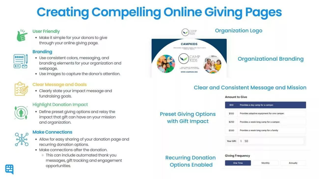
Let’s break down this graphic into actionable steps! So what does donation page optimization even mean? Donation page optimization is when you improve the design of your nonprofit’s online giving page to make them more functional and give the user a better experience. Having a page that is functional, fast, and easy-to-use increases your donor conversion rate – the percentage of people who visit your page and follow through on giving.
Here are six ways that you can optimize your donation pages and increase your nonprofit’s impact and online giving conversion rate. We’ve broken it into simple and manageable steps that you can get started with today! Plus, check out this free donation page cheat sheet!
When a donor has a positive user experience, they are more likely to give again in the future. Optimizing your donation page can also help your nonprofit stand out from other organizations and make a greater impact.
Keep it simple
When it comes to donation pages, simplicity is key. Your page should be easy to navigate, with a clear call to action and minimal distractions. Simplicity keeps your page user-friendly and easily navigable. You want to make sure you have all the necessary information, but avoid cluttered designs, excessive text, or too many form fields that may discourage potential donors.
The harder it is to donate the more likely your donor is to give up during the donation process.
Use consistent and visually appealing branding
A visually appealing donation page encourages donors to give. Use high-quality images, engaging videos, and consistent branding to create a cohesive and compelling user experience.

Donors feel more confident in giving when everything is on one page and branded to your nonprofit. That’s why custom online giving pages or embeddable donation forms are important. When donors are taken to a popup or another page, it can feel like a scam. Donors want to be certain they are giving to you. They don’t want to wonder if the link is legitimate.
Things to consider:
- Use consistent colors
- Have your nonprofit’s logo on the page
- Pull images or messaging from other parts of your website
- Keep everything on your site
When testing your pages, make sure they are easy to read and look good on both desktop and mobile devices.
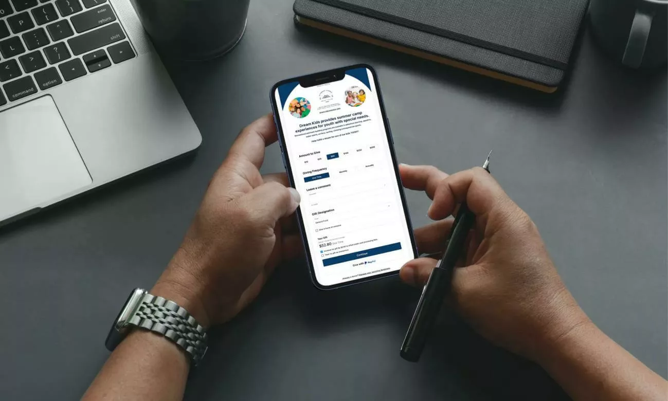
Optimize each donation page for mobile

With the rise of mobile giving, remember to consider mobile devices when making your pages. Your nonprofit will come to mind at random times. Because most people carry their phones with them at all times, a well set up donation page will make it easy for donors to give at any time.
Make sure your page is responsive and easy to navigate on smaller screens. Use large, clear buttons and keep form fields to a minimum to make the giving process as smooth as possible.
Donors don’t want to have to zoom in to fill out a form. They also don’t want to scroll left and right to read everything on your page. We’ve all been there before. It’s frustrating to use a website that isn’t set up for mobile.
Give your donors options
Not all donors are the same, so it’s good to offer a variety of giving options. Allow donors to choose between one-time, recurring, or annual gifts. Offer options like credit cards, ACH, Apple + Google Pay, or PayPal. Giving donors the flexibility to choose how and when they give can increase donations while encouraging repeat giving.
Highlight donation impact
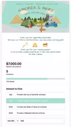
Social proof can be a powerful motivator for donors. Consider showcasing the impact of previous fundraising campaigns or displaying testimonials from satisfied donors. Highlight the difference your work is having on the community. You encourage donors to give and feel good about their donations when you tell the stories of the people your nonprofit serves and the way you help them be the heroes in their own stories.
Make connections
We’re social beings. We want to connect others with the things that are important to us. And we want to be connected with those we are supporting. When your donation page is easy to share, donors are more likely to share it. Help them be the connectors between what they care about and the people in their circles.
And it’s important that you connect with your supporters after they donate. It is important to take the time to thank your donors. I know this is just another thing to add to your already packed plate. Using online giving pages that let you send out automatic receipts and thank you notes right after a gift is sent can be a game changer for your nonprofit.
Conclusion
People who are excited about your mission want to support you! When you make it easy to navigate your donation page, you increase the likelihood that your supporters will follow through on their donations.
As our world becomes increasingly digital, more and more donors will choose to donate online. Pages that are user-friendly and clearly belong to your organization increase the likelihood that a donor will follow through on their donation. Give your donors options by optimizing for mobile use and offering a variety of payment options. And lastly, help your donors build connections – both between what they care about and their community and between them and your organization.
The post Donation Page Optimization: Best Practices for Nonprofit Fundraising appeared first on Nonprofit Hub.

0 Commentaires